You have a website, you’ve listed your services, and you’ve explained a little about what you do. So why are potential clients still leaving without getting in touch?
One place worth looking at is your service page.
A service page needs to do more than list what you offer. It should help potential clients understand what the service involves, whether it’s right for them and what happens if they decide to take the next step.
The good news is that you don’t need a complicated layout or endless amounts of text to do this. You need to give people the information they’re looking for, in an order that makes sense.
Here’s how to approach it.
1. Start with what the service helps people do
It’s tempting to start with the name of your service and a few words about how experienced or passionate you are. But someone visiting the page is probably more interested in their own problem than your professional background.
Start by explaining what the service helps with and who it’s for.
For example, a virtual assistant could write:
“I provide flexible administrative support to small businesses.”
That’s clear enough, but it doesn’t tell a potential client much about when they might need that support.
Something more specific could be:
“I help busy small business owners stay on top of their admin, so important tasks don’t keep getting pushed to the bottom of the list.”
The best wording will depend on your actual service and the clients you want to attract. The point is to help visitors recognise why the service might be relevant to them.
2. Explain what’s included
Once visitors understand what you help with, they’ll want to know what they’re actually getting.
This is where you can describe the tasks, deliverables or support included in the service.
If you’re a VA, that might mean inbox management, diary organisation or preparing documents. If you’re a designer, it could include the number of pages, design stages or revisions included in a project.
Be specific enough to set expectations. A vague promise of “personalised support tailored to your needs” might sound nice, but it doesn’t answer many questions.
You don’t have to list every tiny detail on the page. Focus on the information someone would need to decide whether to enquire.
And if something isn’t included, make that clear where it’s relevant. It can save both you and your potential client an awkward conversation later.
3. Explain how the service works
People may be interested in what you offer but still hesitate because they don’t know what working with you would involve.
Do they need to book a call first? Will you ask them to fill in a questionnaire? How long does the process usually take? What do you need from them to get started?
You don’t need to describe every step in great detail. A short explanation of the process can make the decision feel much easier.
For example:
- Get in touch and tell me what you need help with.
- We’ll discuss the project and agree on the next steps.
- Once everything is confirmed, I’ll get started.
Of course, adapt this to how you actually work. There’s no point promising a process you don’t use just because it looks tidy on a website.
4. Show the value, not just the task list
Listing what’s included is useful, but it doesn’t always explain why someone should care.
Think about what the service helps your client achieve.
An organised inbox is a task. Having a clearer view of important messages and fewer things slipping through the cracks is the benefit.
A redesigned website is a deliverable. Making it easier for visitors to understand your services and find the information they need is a potential benefit.
You don’t need to promise dramatic results or guarantee things you can’t control. Just explain why the work matters to the person paying for it.
This is also a good place to use a relevant example or testimonial, if you have one. A genuine client comment can help people understand what it’s like to work with you. If you don’t have testimonials yet, don’t worry about filling the space with something else just for the sake of it.
5. Answer the questions people might have before contacting you
Before someone enquires, they may be wondering about practical details.
Depending on your service, these could include:
- How much does it cost?
- How long will it take?
- Is this service suitable for my business?
- What do I need to provide?
- What happens after I get in touch?
You don’t necessarily need a long FAQ section. Include the answers that are most relevant to your service, either in the main content or in a short set of frequently asked questions.
If your price depends on the size or complexity of a project, explain that briefly. If you offer a fixed-price service, displaying the price can help visitors decide whether it’s within their budget.
You won’t be able to answer every possible question, and that’s fine. The aim is to remove avoidable uncertainty, not to write an instruction manual.
6. Make the next step clear
Once someone has read the page and decided your service might be a good fit, what should they do?
Don’t leave them to work it out.
Choose a clear next step that matches the service. That might be enquiring about a project, booking an initial call, requesting a quote or purchasing a defined service.
Use a button or link with wording that tells people what to expect. “Enquire about this service” is more informative than a vague “Click here”.
Place the call to action where it makes sense, and consider repeating it near the end of a longer page. Someone who has read all the details shouldn’t have to scroll back to the top to find out how to contact you.
You don’t need a button after every paragraph. One clear action is often more useful than several competing options.
7. Give the page room to breathe
The words matter, but the way you present them matters too.
A service page can become difficult to use if it’s one long block of text, with every detail given the same visual weight.
Use headings to divide the information into sections. Keep paragraphs manageable, and use bullet points when they’re genuinely easier to scan than sentences.
Make sure the text is readable, the contrast is sufficient and the important information isn’t buried among decorative elements.
Images can help when they show something relevant, such as examples of your work. They don’t need to be there simply because the page looks a bit empty.
Before adding another section, ask yourself whether it helps visitors understand the service or make a decision. If it doesn’t, it may not need to be there.
A quick check of your own service page
Open one of your service pages and look at it from the perspective of someone considering hiring you.
Can you find clear answers to these questions?
- What problem does this service help with?
- What’s included?
- How does the process work?
- Why might this service be useful to me?
- What practical details do I need to know?
- What’s the next step if I’m interested?
If some of the answers are missing, start there. You don’t need to rewrite the entire page in one sitting.
Sometimes a clearer explanation, a missing detail or a more useful call to action is enough to make the page easier to understand and use.
Need a fresh pair of eyes?
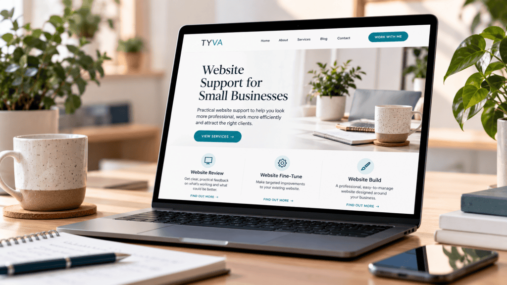
If you’re not sure what’s missing from your service page, or you know something isn’t working but can’t quite put your finger on it, a website review can help you work out where to start.
My £50 Website Review looks at your website and gives you practical recommendations on what could be clearer, what needs attention and what to fix first.