You built your website yourself.
The pages are there, your logo is in place, the colours work together, and you’ve probably spent far longer choosing fonts than you ever expected to.
So why does it still feel a little bit… off?
Maybe it doesn’t look quite as polished as the websites you like. Maybe you’ve moved sections around, changed the fonts, replaced images and wondered if you should just start again.
Before you do that, take a breath.
Your website probably isn’t broken. It may just need a few things to make it feel clearer, more intentional and easier for people to use.
Here are some of the things I would look at first.
1. Everything is competing for attention
One of the easiest ways to make a website feel amateur is to make everything equally important.
Big heading. Bold button. Huge image. Another heading. Another button. Three different font sizes. A colourful section. Then something else that wants your attention.
When everything is trying to stand out, nothing really does.
Your visitor shouldn’t have to work out where to look first. A good visual hierarchy gives them a path through the page. They should be able to see the main message first, then understand what you offer, why it matters and what they can do next.
You don’t need more design elements. You may simply need fewer things fighting for attention.
2. You’re trying to say too much
This is very common on DIY business websites.
You know your business inside out, so naturally you want to explain everything. Every service, every qualification, every detail and every possible question someone might have.
The problem is that your visitor doesn’t have the same context.
They’ve just arrived. They don’t need your entire business story straight away. They need to understand the basics:
What do you do?
Who do you help?
Why should they care?
What should they do next?
If someone has to read five paragraphs before they understand what you actually offer, your website is making them work too hard.
Clarity doesn’t mean leaving important information out. It means giving the right information the right amount of space.
3. The important things aren’t obvious
Imagine someone lands on your homepage and wants to work with you.
Can they quickly find your services? Can they tell how you can help them? Can they see what to do next?
This is where your calls to action matter.
A CTA doesn’t have to be clever. In fact, it probably shouldn’t be.
“Book a call.”
“Get a quote.”
“See my services.”
“Download the checklist.”
These are perfectly good calls to action because people know what will happen when they click.
If the thing you most want someone to do is hidden at the bottom of the page, surrounded by three other buttons, it probably isn’t doing its job.
Your website should make the next step feel obvious.
4. Your website talks about you more than it talks about your customer
This one is easy to miss because, well, it is your website.
Of course you want to talk about yourself. You want people to know who you are, what you’ve done and why you’re good at what you do.
But your visitor usually arrives with a problem.
They’re not thinking, “I wonder what qualifications this business owner has?”
They’re thinking, “Can this person help me?”
Your experience absolutely matters. Your story matters too. But try reading your homepage from your customer’s point of view.
Instead of asking, “Have I included everything I want to say?”, ask:
“Does this help my visitor understand why I’m relevant to them?”
That small change in perspective can make a surprisingly big difference.
5. Your website tells me what you’ve done, but not how you can help me
I see this a lot with service-based businesses, and especially with VAs.
A website might tell me that you’ve spent 20 years working in administration, that you’re highly organised, that you’ve completed six different courses and that you have certificates in all sorts of useful things.
Great.
But I’m still sitting there wondering:
What can you actually help me with?
If I’m a business owner looking for support, I don’t necessarily care that you completed a particular course. I want to know what problem you can take off my plate.
Can you manage my inbox? Keep my CRM updated? Deal with customer enquiries? Help me with my website?
Tell me that.
Your experience and qualifications can absolutely build trust. They just shouldn’t make your visitor do the work of figuring out what any of it means for them.
A certificate can tell me that you learned something. It doesn’t automatically tell me what you can do for my business.
6. Your colours might be lovely, but that doesn’t mean they work together
You can choose three individually lovely colours and still end up with a website that feels a bit confused.
Maybe the contrast isn’t strong enough, so the text is difficult to read. Maybe everything is equally bright, so nothing has enough space to stand out. Or maybe you’ve fallen in love with a colour palette from Pinterest and tried to make it work absolutely everywhere.
We’ve all been there.
Colour isn’t just decoration. It needs to help people read, navigate and understand what’s important.
You don’t need a complicated colour system. You just need colours that work together and enough contrast for people to actually see what you’ve written.
7. Not everything needs to move
A button slides in.
Then the image fades in.
Then the heading moves slightly to the left.
Then something else starts floating around the screen.
Because apparently if it moves, it must be modern.
It doesn’t.
Sometimes it just makes the website harder to look at.
Animation can be useful when it helps guide attention or adds a bit of personality. But if everything is moving, nothing feels particularly important.
The same goes for design in general. Bigger doesn’t always mean better. More doesn’t always mean more professional.
Sometimes less really is more.
8. You’re looking at your website from the inside
This might be the biggest problem of all.
You’ve built the website. You’ve looked at the homepage hundreds of times. You’ve rewritten the headline, moved the image, changed the button and probably changed the image again.
You know what you meant every section to say.
And that’s exactly the problem.
You know too much.
A new visitor doesn’t know what you know. They don’t know what your business does unless you tell them. They don’t know which service is right for them, where to click or why you’ve chosen that particular image.
They simply arrive and try to work it out.
That’s why sometimes you can stare at your website for another three hours and still not see what’s wrong.
You aren’t necessarily bad at websites.
You’re just too close to your own.
So, do you need a new website?
Maybe.
But don’t assume that’s the answer.
Sometimes a website genuinely needs a redesign. Sometimes it needs a few strategic changes. And sometimes the biggest improvements come from fixing five relatively small things.
Before you spend weeks rebuilding everything — or hundreds or thousands on a completely new website — it’s worth finding out which one you’re actually dealing with.
Start with the basics.
Look at your homepage as if you’ve never seen your business before.
Can you understand what the business does within a few seconds? Can you tell who it’s for? Can you find the most important information? Can you see what to do next?
If the answer is “sort of”, that’s useful information.
You probably don’t need to throw everything away. You just need to work out what deserves your attention first.
Want to take another look yourself?
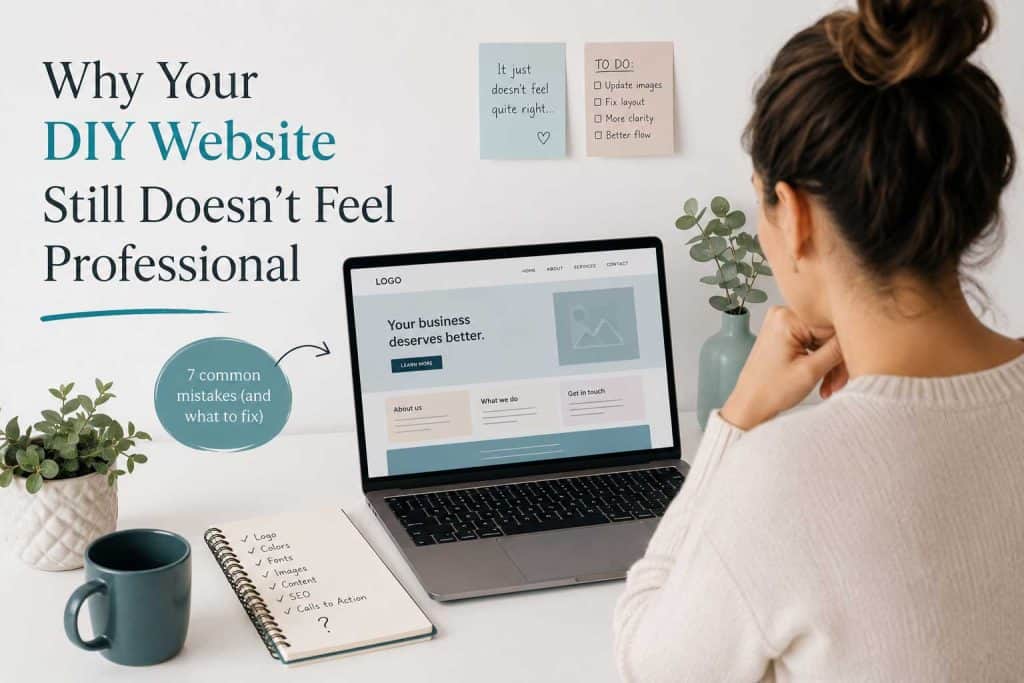
I’ve created a free checklist covering 7 common mistakes that can make a DIY website look amateur.
It’s designed to give you a simple starting point without sending you down another three-hour website rabbit hole.
And if you’ve already tried that and you’re still thinking:
“I can see that something isn’t quite right, but I have absolutely no idea what it is…”
That’s exactly where a second pair of eyes can help.
I’ll look at your website with fresh eyes and give you:
- a full design and layout review
- a written priority list
- specific, actionable recommendations
- a clear idea of what I’d fix first
And if your website doesn’t need a complete overhaul, I’ll tell you that too.
Your website doesn’t have to be perfect.
It just needs to make it easy for the right people to understand your business, trust you and take the next step.